Rebecca Hyett-Brown

Operations Manager

Colour Matters

Does Colour Really Influence How Customers Behave?

Rebecca Hyett-Brown

Operations Manager

Colour Matters

Does Colour Really Influence How Customers Behave?

Does colour really influence how customers behave?

Colour is one of those things we all react to, usually without even realising we’re doing it.

You walk into one restaurant and immediately feel like settling in for the evening. Another feels bright, energetic and somewhere you’d grab a quick lunch. Then there are those spaces that just feel right, even if you can’t quite put your finger on why.

Colour is rarely the only reason, but it’s definitely part of the story to a great, designed space.

As a designer, I’m always thinking about colour. Not just “does this look nice?”, but “what is this actually doing to the space?”

It’s not as simple as “red makes you hungry”

We’ve probably all heard the usual colour psychology rules. Red creates urgency. Blue is calming. Green feels natural. Yellow makes us happy. There’s some truth behind the idea that colour can affect our perception and emotions, but I think it becomes a bit dangerous when we treat it like a formula.

'If red automatically made people hungry, designing restaurants would be very easy!

We experience colour as part of everything else around us, lighting, materials, texture, sound, furniture, branding and even the time of day. A deep burgundy wall under warm lighting can feel intimate and sophisticated. Put a brighter version of that same colour under harsh lighting and suddenly you’ve created a completely different atmosphere. I believe context matters when choosing colours.

So, can colour change customer behaviour?

I think a better way of looking at it is that colour can help create an environment that encourages certain behaviours. If I’m designing somewhere that wants customers to stay, relax, order another drink and enjoy the evening, I might approach the palette very differently to a fast-paced lunchtime venue that needs to feel fresh, lively and easy to navigate. That doesn’t mean painting a wall a certain colour magically makes someone stay for another hour.

It means we’re using colour as one of many design tools to create the right feeling. And feeling is incredibly important in retail, hospitality and food & beverage. Customers might not walk away saying, “I really enjoyed the tonal balance of that interior.” Hopefully not, anyway, they’ll say, “I loved the atmosphere in there.” …And that’s the difference.

Sometimes the right colour is already there…

When we start developing a concept at RDS 360, we don’t necessarily begin with a colour palette. I personally begin with the brand. Who are they? Who are their customers? What are they trying to achieve? Is this somewhere for a quick coffee, a family meal, a date night or cocktails with friends? What should someone feel when they walk through the door? And, importantly, what is it our client is trying to achieve?

Sometimes we’re creating something completely new. Other times, a brand already has a strong identity, and our job is to take what works and evolve it. A great example for me is our work with CVS, a veterinary client with around 500 sites.

They already had an established brand and colour palette, but the challenge was to develop the environment and move away from that traditional, clinical feeling you often associate with a veterinary waiting room. We wanted the spaces to feel calmer, softer and more welcoming, particularly when you consider that customers (and their pets!) might already be arriving feeling a little anxious. Blue was an important part of the existing palette. On paper, you could easily think blue + veterinary practice = cold and clinical. But that’s where shade, material and context make such a difference. By looking at the tone of blue, how and where we used it, the lighting around it, and what we paired it with, warmer timber furniture, flooring, signage and softer finishes, the result was a fresh, cohesive environment that still felt recognisable to the brand, but much calmer and gentler. For me, that project is a great example of how you don’t necessarily need to change a brand colour.

Sometimes you just need to change the way you use it. You don’t always need to shout.

Material changes colour too…

This is probably one of my favourite parts. The same colour can behave completely differently depending on the material. A deep red in a matt painted finish feels completely different to deep red leather, a glossy ceramic tile or a translucent glass block glowing under warm light. That’s why material boards are such an important part of our design process. We're not choosing colours in isolation; we're looking at how everything sits together. Warm metals against burgundy leather. Cream stone next to dark timber. A glossy tile catching the light beside something much softer and more textured. Those little relationships are what start giving a space depth and personality.

And then there’s lighting…

You can spend hours choosing the perfect colour and then completely change it with the wrong lighting. Natural daylight, warm evening lighting, spotlights and decorative pendants can all alter how we perceive a finish. For hospitality spaces, I think it’s important to consider how the interior changes throughout the day. Something that looks beautiful at 11am needs to still feel intentional at 8pm. And sometimes it should feel different. That's part of the experience.

For me, colour is about telling the right story. So, does colour really influence customer behaviour? Yes, but perhaps not in the simplistic way we're sometimes led to believe.

I don't think there's a magic shade of red that sells more burgers, or a particular green that suddenly makes everyone feel relaxed. Good design is much more layered than that. Colour works alongside layout, lighting, materials, acoustics, branding and operational design to create an atmosphere. And when all those things come together properly, customers don't necessarily notice the individual decisions.

They just know how the space makes them feel.

And, for me, that's where the interesting bit of design really begins.
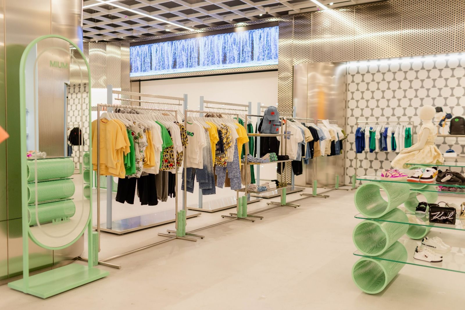
Does colour really influence how customers behave?

Colour is one of those things we all react to, usually without even realising we’re doing it.

You walk into one restaurant and immediately feel like settling in for the evening. Another feels bright, energetic and somewhere you’d grab a quick lunch. Then there are those spaces that just feel right, even if you can’t quite put your finger on why.

Colour is rarely the only reason, but it’s definitely part of the story to a great, designed space.

As a designer, I’m always thinking about colour. Not just “does this look nice?”, but “what is this actually doing to the space?”

It’s not as simple as “red makes you hungry”

We’ve probably all heard the usual colour psychology rules. Red creates urgency. Blue is calming. Green feels natural. Yellow makes us happy. There’s some truth behind the idea that colour can affect our perception and emotions, but I think it becomes a bit dangerous when we treat it like a formula.

'If red automatically made people hungry, designing restaurants would be very easy!

We experience colour as part of everything else around us, lighting, materials, texture, sound, furniture, branding and even the time of day. A deep burgundy wall under warm lighting can feel intimate and sophisticated. Put a brighter version of that same colour under harsh lighting and suddenly you’ve created a completely different atmosphere. I believe context matters when choosing colours.

So, can colour change customer behaviour?

I think a better way of looking at it is that colour can help create an environment that encourages certain behaviours. If I’m designing somewhere that wants customers to stay, relax, order another drink and enjoy the evening, I might approach the palette very differently to a fast-paced lunchtime venue that needs to feel fresh, lively and easy to navigate. That doesn’t mean painting a wall a certain colour magically makes someone stay for another hour.

It means we’re using colour as one of many design tools to create the right feeling. And feeling is incredibly important in retail, hospitality and food & beverage. Customers might not walk away saying, “I really enjoyed the tonal balance of that interior.” Hopefully not, anyway, they’ll say, “I loved the atmosphere in there.” …And that’s the difference.

Sometimes the right colour is already there…

When we start developing a concept at RDS 360, we don’t necessarily begin with a colour palette. I personally begin with the brand. Who are they? Who are their customers? What are they trying to achieve? Is this somewhere for a quick coffee, a family meal, a date night or cocktails with friends? What should someone feel when they walk through the door? And, importantly, what is it our client is trying to achieve?

Sometimes we’re creating something completely new. Other times, a brand already has a strong identity, and our job is to take what works and evolve it. A great example for me is our work with CVS, a veterinary client with around 500 sites.

They already had an established brand and colour palette, but the challenge was to develop the environment and move away from that traditional, clinical feeling you often associate with a veterinary waiting room. We wanted the spaces to feel calmer, softer and more welcoming, particularly when you consider that customers (and their pets!) might already be arriving feeling a little anxious. Blue was an important part of the existing palette. On paper, you could easily think blue + veterinary practice = cold and clinical. But that’s where shade, material and context make such a difference. By looking at the tone of blue, how and where we used it, the lighting around it, and what we paired it with, warmer timber furniture, flooring, signage and softer finishes, the result was a fresh, cohesive environment that still felt recognisable to the brand, but much calmer and gentler. For me, that project is a great example of how you don’t necessarily need to change a brand colour.

Sometimes you just need to change the way you use it. You don’t always need to shout.

Material changes colour too…

This is probably one of my favourite parts. The same colour can behave completely differently depending on the material. A deep red in a matt painted finish feels completely different to deep red leather, a glossy ceramic tile or a translucent glass block glowing under warm light. That’s why material boards are such an important part of our design process. We're not choosing colours in isolation; we're looking at how everything sits together. Warm metals against burgundy leather. Cream stone next to dark timber. A glossy tile catching the light beside something much softer and more textured. Those little relationships are what start giving a space depth and personality.

And then there’s lighting…

You can spend hours choosing the perfect colour and then completely change it with the wrong lighting. Natural daylight, warm evening lighting, spotlights and decorative pendants can all alter how we perceive a finish. For hospitality spaces, I think it’s important to consider how the interior changes throughout the day. Something that looks beautiful at 11am needs to still feel intentional at 8pm. And sometimes it should feel different. That's part of the experience.

For me, colour is about telling the right story. So, does colour really influence customer behaviour? Yes, but perhaps not in the simplistic way we're sometimes led to believe.

I don't think there's a magic shade of red that sells more burgers, or a particular green that suddenly makes everyone feel relaxed. Good design is much more layered than that. Colour works alongside layout, lighting, materials, acoustics, branding and operational design to create an atmosphere. And when all those things come together properly, customers don't necessarily notice the individual decisions.

They just know how the space makes them feel.

And, for me, that's where the interesting bit of design really begins.

More articles

Explore our full library of insights, stories, and ideas.

More articles

Explore our full library of insights, stories, and ideas.

More articles

Explore our full library of insights, stories, and ideas.

See what a 360° approach can do for your project

baku-mium-store

Contact us

See what a 360° approach can do for your project

baku-mium-store

Contact us

See what a 360° approach can do for your project

baku-mium-store

Contact us